/dev/reading
Category

Data Visualization

6 books
Order by
View
by Stephen A. Thomas

You’ve got data to communicate. But what kind of visualization do you choose, how do you build your visualizations, and how do you ensure that they're up to the demands of the Web?

In Data Visualization with JavaScript, you’ll learn how to use JavaScript, HTML, and CSS to build practical visualizations for your data. Step-by-step examples walk you through creating, integrating, and debugging different types of visualizations and you'll be building basic visualizations (like bar, line, and scatter graphs) in no time.

You'll also learn how to:

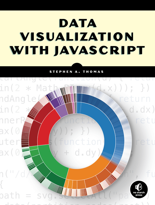
  • Create tree maps, heat maps, network graphs, word clouds, and timelines
  • Map geographic data, and build sparklines and composite charts
  • Add interactivity and retrieve data with AJAX
  • Manage data in the browser and build data-driven web applications
  • Harness the power of the Flotr2, Flot, Chronoline.js, D3.js, Underscore.js, and Backbone.js libraries

If you already know your way around building a web page but aren’t quite sure how to build a good visualization, Data Visualization with JavaScript will help you get your feet wet without throwing you into the deep end. You’ll soon be well on your way to creating simple, powerful data visualizations.

Download the source code

A Primer on Making Informative and Compelling Figures
by Claus O. Wilke

Effective visualization is the best way to communicate information from the increasingly large and complex datasets in the natural and social sciences. But with the increasing power of visualization software today, scientists, engineers, and business analysts often have to navigate a bewildering array of visualization choices and options.

This practical book takes you through many commonly encountered visualization problems, and it provides guidelines on how to turn large datasets into clear and compelling figures. What visualization type is best for the story you want to tell? How do you make informative figures that are visually pleasing? Author Claus O. Wilke teaches you the elements most critical to successful data visualization.

  • Explore the basic concepts of color as a tool to highlight, distinguish, or represent a value
  • Understand the importance of redundant coding to ensure you provide key information in multiple ways
  • Use the book’s visualizations directory, a graphical guide to commonly used types of data visualizations
  • Get extensive examples of good and bad figures
  • Learn how to use figures in a document or report and how employ them effectively to tell a compelling story
by Chris Garrard

Geoprocessing with Python teaches you how to use the Python programming language, along with free and open source tools, to read, write, and process geospatial data.

Understanding data with graphs
by Philipp K. Janert

Gnuplot in Action, Second Edition is a major revision of this popular and authoritative guide for developers, engineers, and scientists who want to learn and use gnuplot effectively. Fully updated for gnuplot version 5, the book includes four pages of color illustrations and four bonus appendixes available in the eBook.

An Introduction to Designing with D3
by Scott Murray

Create and publish your own interactive data visualization projects on the webâ??even if you have little or no experience with data visualization or web development. Itâ??s inspiring and fun with this friendly, accessible, and practical hands-on introduction. This fully updated and expanded second edition takes you through the fundamental concepts and methods of D3, the most powerful JavaScript library for expressing data visually in a web browser.

Ideal for designers with no coding experience, reporters exploring data journalism, and anyone who wants to visualize and share data, this step-by-step guide will also help you expand your web programming skills by teaching you the basics of HTML, CSS, JavaScript, and SVG.

  • Learn D3 with downloadable code and over 140 examples
  • Create bar charts, scatter plots, pie charts, stacked bar charts, and force-directed graphs
  • Use smooth, animated transitions to show changes in your data
  • Introduce interactivity to help users explore your data
  • Create custom geographic maps with panning, zooming, labels, and tooltips
  • Walk through the creation of a complete visualization project, from start to finish
  • Explore inspiring case studies with nine accomplished designers talking about their D3-based projects
by Cole Nussbaumer Knaflic

This is not a book. It is a one-of-a-kind immersive learning experience through which you can become—or teach others to be—a powerful data storyteller.

Let’s practice! helps you build confidence and credibility to create graphs and visualizations that make sense and weave them into action-inspiring stories. Expanding upon best seller storytelling with data’s foundational lessons, Let’s practice! delivers fresh content, a plethora of new examples, and over 100 hands-on exercises. Author and data storytelling maven Cole Nussbaumer Knaflic guides you along the path to hone core skills and become a well-practiced data communicator. Each chapter includes:

  • Practice with Cole: exercises based on real-world examples first posed for you to consider and solve, followed by detailed step-by-step illustration and explanation
  • Practice on your own: thought-provoking questions and even more exercises to be assigned or worked through individually, without prescribed solutions
  • Practice at work: practical guidance and hands-on exercises for applying storytelling with data lessons on the job, including instruction on when and how to solicit useful feedback and refine for greater impact

The lessons and exercises found within this comprehensive guide will empower you to master—or develop in others—data storytelling skills and transition your work from acceptable to exceptional. By investing in these skills for ourselves and our teams, we can all tell inspiring and influential data stories!